I tend to have a lot of fun with underpaintings, which is ironic considering the fact that I didn't do them for a long time after I first started painting.
An underpainting is exactly what it sounds like--a painting underneath a painting. Traditionally it's done in shades of sienna (a lovely reddish brown color) mixed with varying amounts of solvent (ie paint thinner. oil paint can't be mixed with water). The point is to help the artist get the values of a piece down before they start to layer paint on. I like underpainting for the little boost of help, but I also love the subtle things it can do to a finished piece.

I started experimenting with different colored underpaintings at Santa Clara. My apples piece is actually kind of a study in what different colored underpaintings can do to a finished piece. I started each panel off with a different color: (clockwise from top left) blue, yellow, green, and red. I wanted to see what would happen to the finished product and whether it would even be noticeable. It might not be to the average viewer, but I can sure tell which is which still!
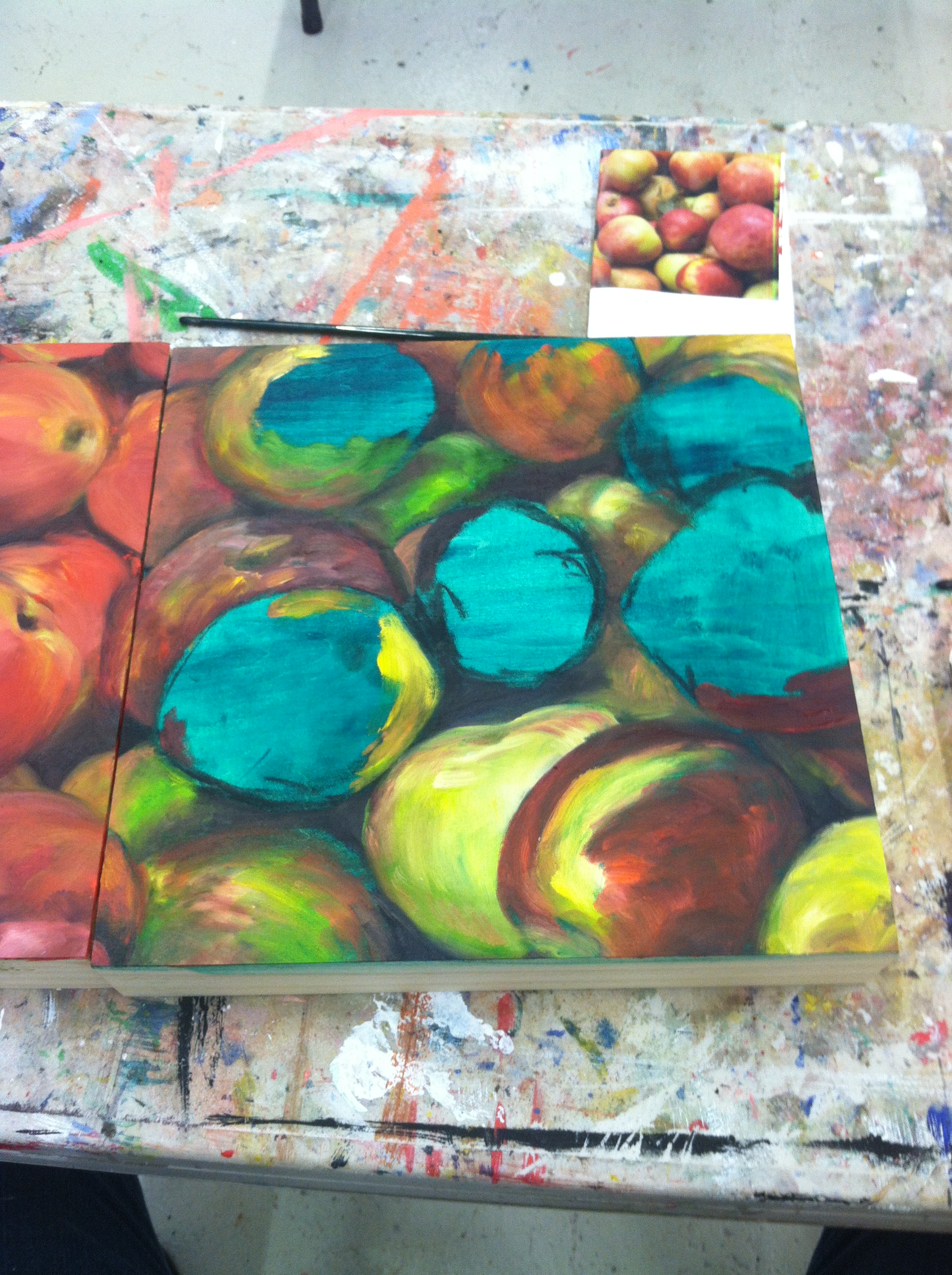
the green one in progress

this is how they all started. I was less concerned with the value help and more concerned with how the colors would work together, so I just painted them all one flat color to start

The finished product! Can you tell the starting colors apart?
It was so much harder to get the right contrast down for the red and yellow panels. I realized that when I started with a color too similar to the end product or too bright, it made building up the dark parts harder than usual. The green panel, on the other hand, stayed too dark throughout the entire process. It took a lot of work to make sure it didn't turn out significantly darker than the other panels. The blue panel was a revelation, and remains my favorite. I discovered that starting with a field of blue made building up my contrasts easier, and leaving little bits of blue poking through the red made the whole piece more interesting.
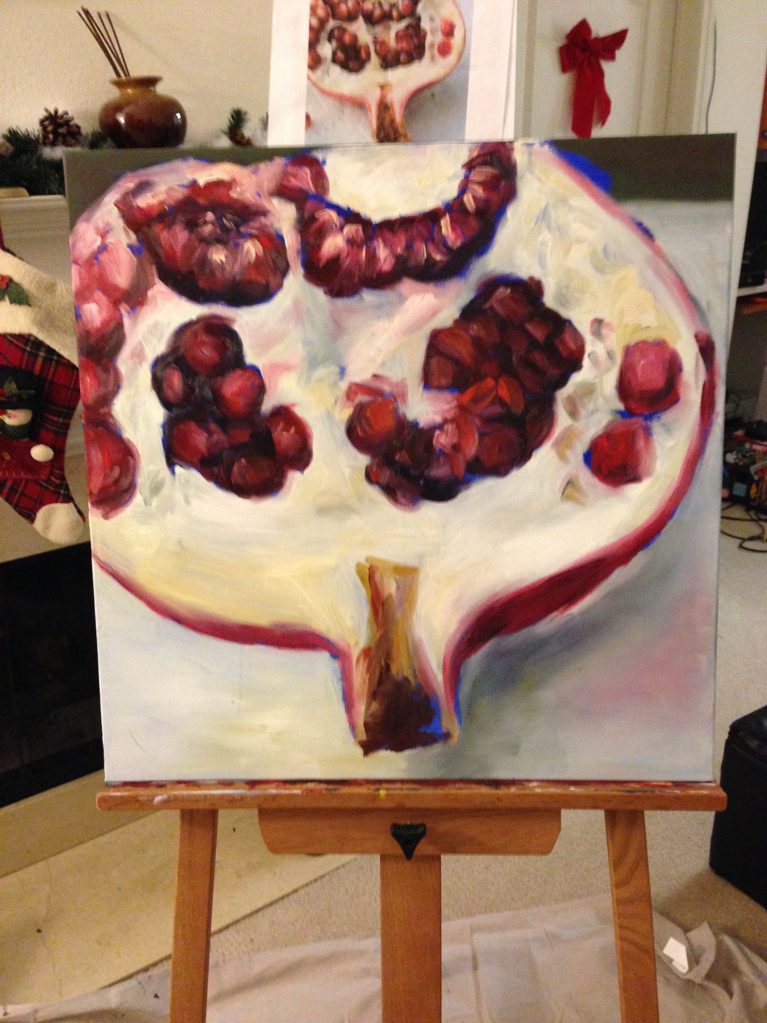
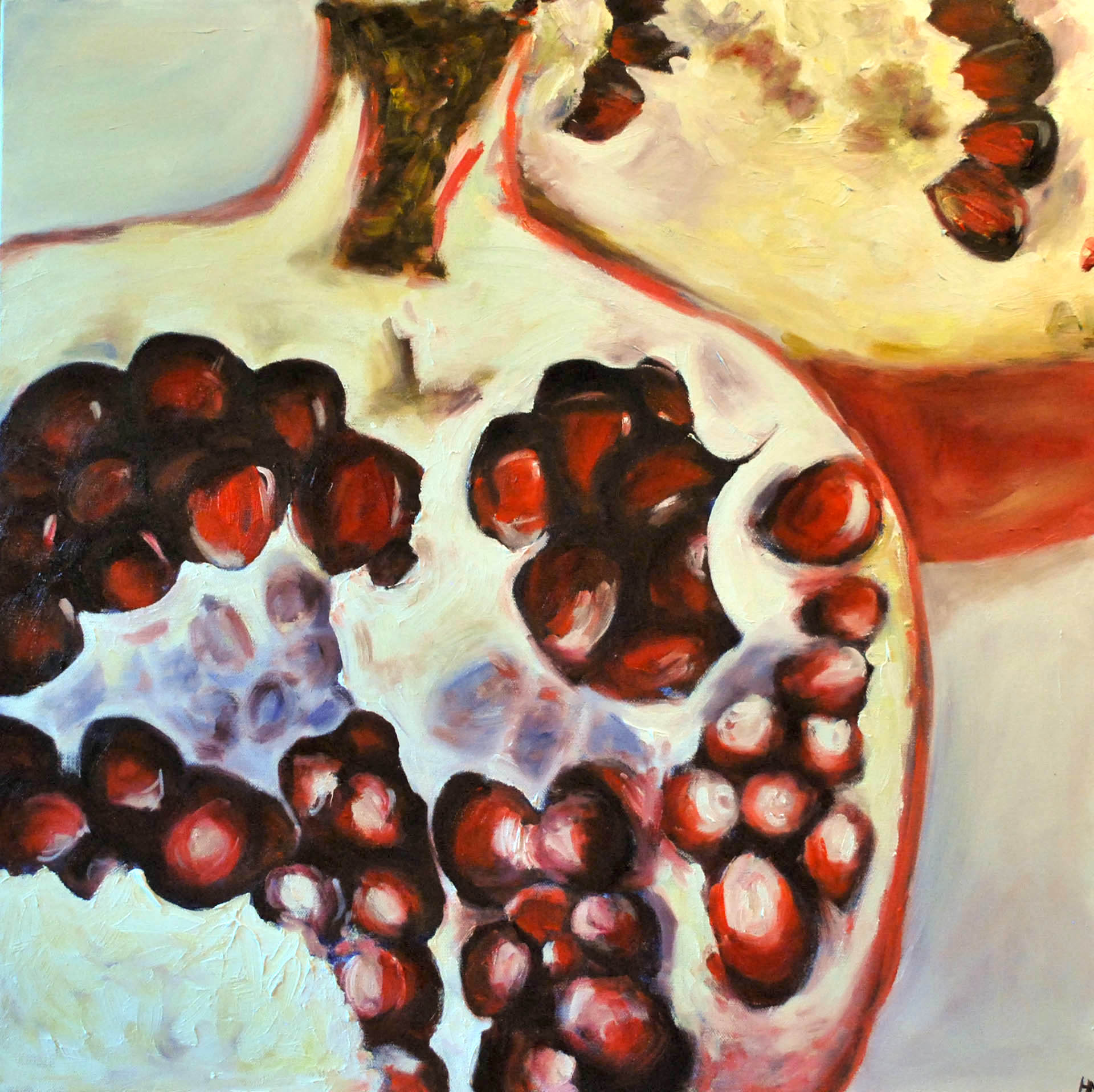
So I ran with the blue thing. Both of the pomegranate paintings I've done started with a blue underpainting. I think it adds just a little extra depth and a unique quality to these pieces. What do you think?
Pomegranates in progress

First piece done. Can you see the blue bits?
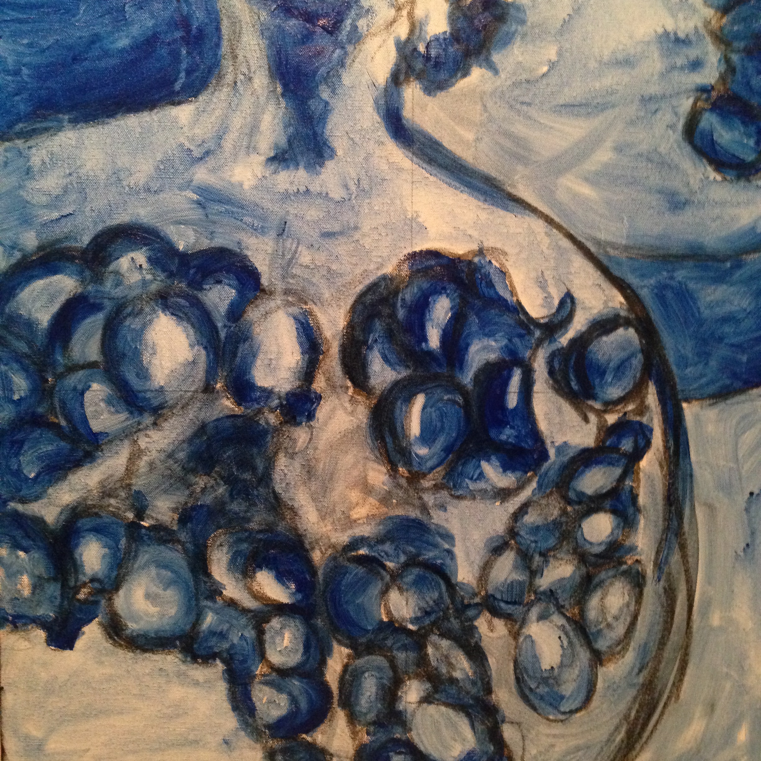
Underpainting for Pomegranates II. It's a lot more detailed than the other blue ones I've done.
Pomegranates II all done!
I intend to keep experimenting with different colors to see how they affect my finished pieces, and will of course write up those experiments as I go. Now you know all about underpaitnings! What do you think, are they worthwhile or do they add less to the finished piece than I think they do?